Project Overview
As part of the Google UX Design program, I chose the Virtual Art Tool for Gallery as my design project. This app targets art enthusiasts seeking to stay informed about the latest exhibitions and discover emerging artists. It also offers new artists a platform to showcase their work directly to art lovers and gallery representatives.
Timeline
12 weeks
My Role
UX designer and researcher, from conception to delivery
Responsibility
User research, user persona, user journey, competitive audit, paper and digital wire-framing, low & high-fidelity prototyping, usability studies, and iterating on responsive design
Summary
Product Vision
As part of the requirements for the Google UX Design program, I selected the Virtual Art Tool for Gallery as my first design project. This app is created for art enthusiasts who enjoy keeping up with the latest exhibitions and discovering emerging artists. Additionally, the platform serves as a space for new artists to showcase their work directly to art lovers and gallery representatives
The Problem
Art lovers with busy schedules often struggle to stay updated on the latest developments in the art world, which limits their ability to connect with like-minded enthusiasts and discover works by emerging artists.
The Goal
This app enables art lovers with busy schedules to participate in art events either physically or virtually, providing opportunities to discover new artwork and connect with emerging artists.
Understandign the Users
Summary
My initial assumption was that the primary user group would be middle-aged individuals who collect artwork as a hobby. To validate this, I interviewed potential users of the Virtual Art Tool (Artist Discovery app), selecting participants with a wide range of backgrounds. The interviews confirmed my assumption but also revealed an additional user group: young professionals interested in attending more art events but constrained by limited resources such as time and money. Across both groups, common pain points emerged, including difficulty keeping track of art events and limited access to artwork and emerging artists.
During the design research phase, user feedback on the virtual tool was generally negative for two main reasons: users did not have access to the AR tool, and the "virtual" experience provided by other apps was unsatisfactory. Based on these findings, I have decided to postpone the integration of the virtual tool functionality in this app and plan to include it in the next version.
Designer's Note
Pain Points
Busy Schedule
Users have limited time or demanding schedules that prevent them from visiting art galleries in person
Limited Resources
Barriers include constraints related to time, money, access to artists and gallery curators, and travel capabilities
Liveness
Virtual presentations cannot fully capture details such as brushwork, lighting, and spatial experience as effectively as physical presence
Accessibility
There is a need for dedicated display and promotional space to showcase the work of emerging artists
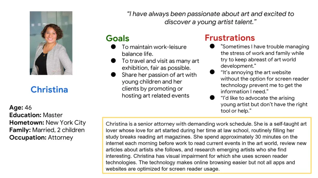
Persona
Problem statement Christina is a busy senior attorney who wants to stay informed about developments in the art world and explore emerging artists’ work, so she can share her passion and support artists without investing too much of her time.
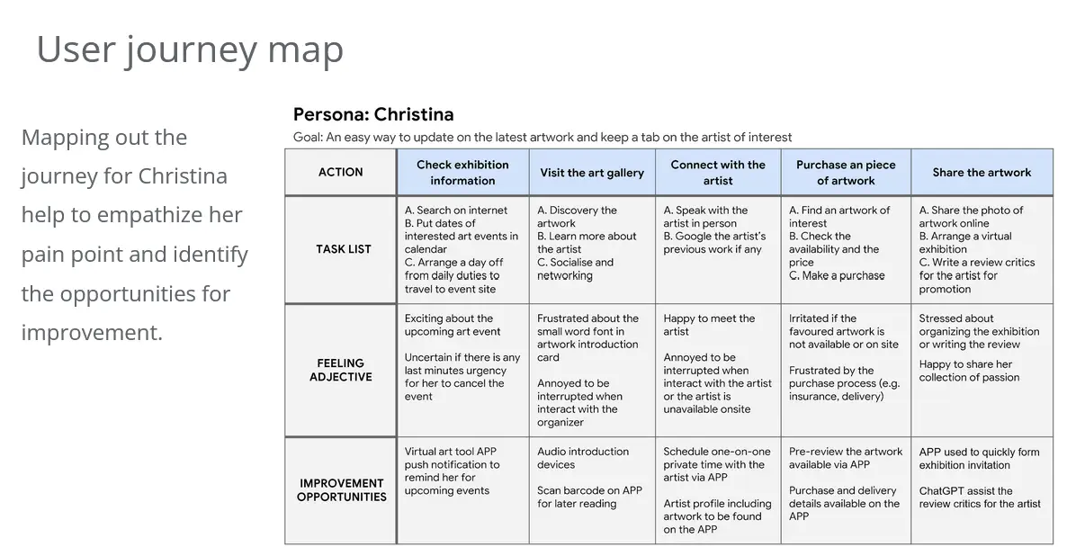
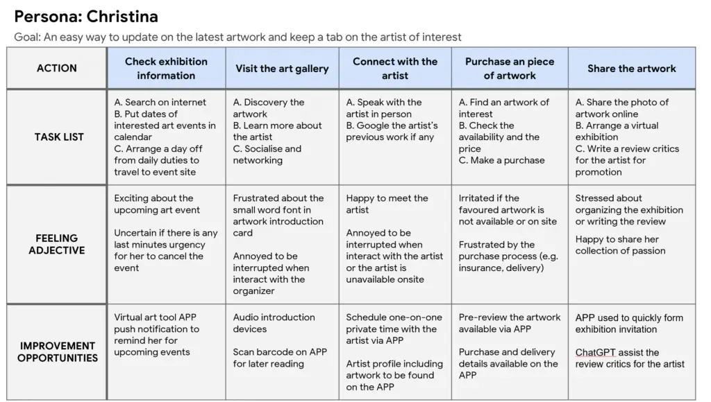
User Journey Maps
Mapping Christina’s journey helps to understand her pain points and uncover opportunities for improvement.
Starting the design
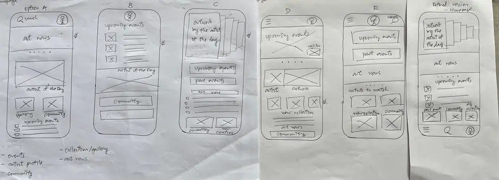
Paper wireframes
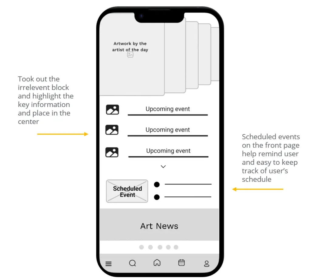
Drafting iterations of each app screen on paper ensured that the elements included in the digital wireframes effectively addressed user pain points. For the home screen, I prioritized placing upcoming and scheduled events near the lower center, making them easily noticeable for users. This approach helped create a clear, user-focused layout before moving into higher-fidelity designs.
Digital wireframes
Taking the time to sketch iterations of each app screen on paper ensured that the elements included in the digital wireframes effectively addressed user pain points. For the home screen, I prioritized placing upcoming and scheduled events near the lower center, making them easily noticeable for users. This low-fidelity approach allowed me to focus on layout and content hierarchy before moving to more detailed digital designs, ensuring a clear and user-centered interface.
Low-fidelity prototype
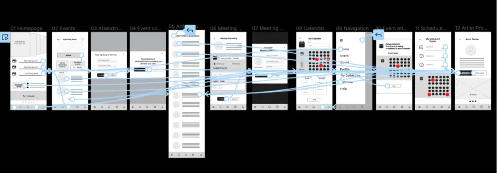
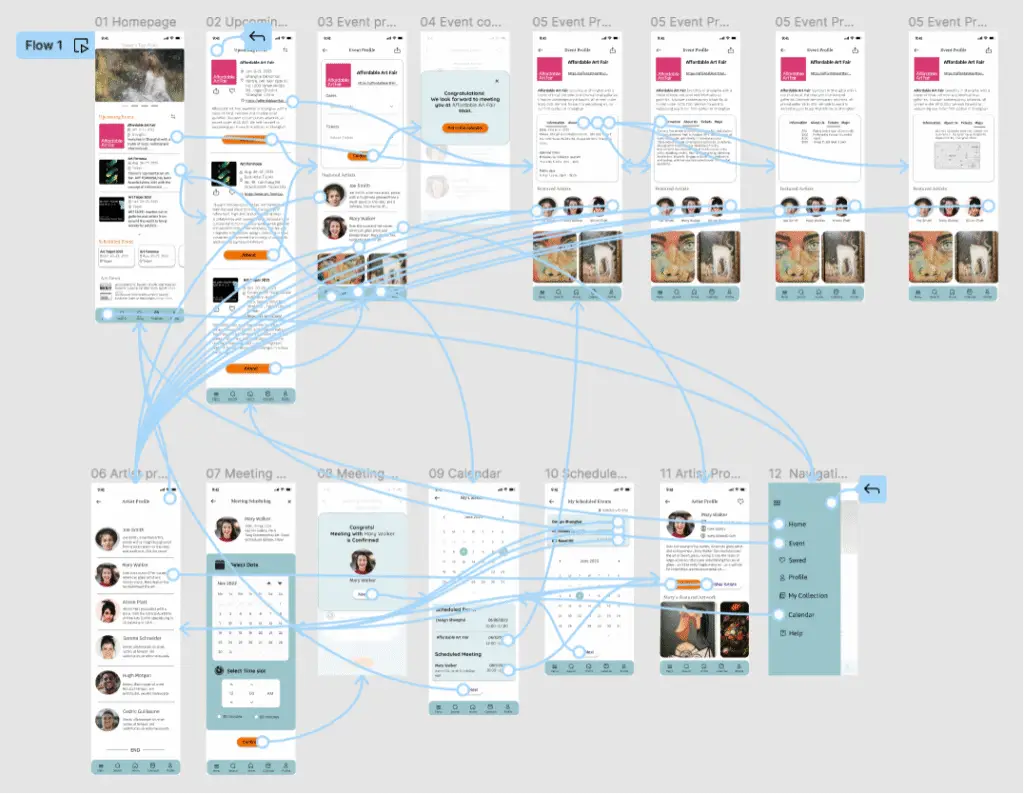
The low-fidelity prototype links the primary user flow of attending an event and scheduling a meeting with an artist, making it suitable for usability testing with users. You can test the prototype here.
Usibility study findings
I conducted two rounds of usability studies. Insights from the first study guided the transition from wireframes to mock-ups, while the second study, using a high-fidelity prototype, identified specific areas of the mock-ups that required refinement.
Round 1 findings
- User needs a "Return" button
- User wants to find Schedule Events
- User need to know if a confirmation is completed
Round 2 findings
- User need better cues to make change and reschedule easily
- User need more options to select for details
- User want calendar with integration accessibility to other software
Refining the design
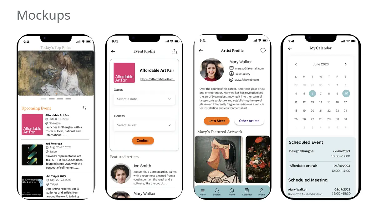
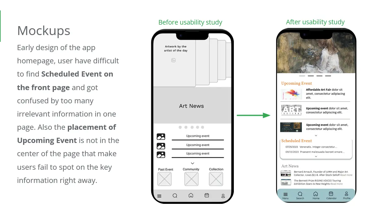
Mockups
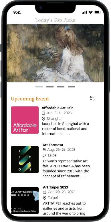
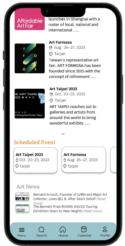
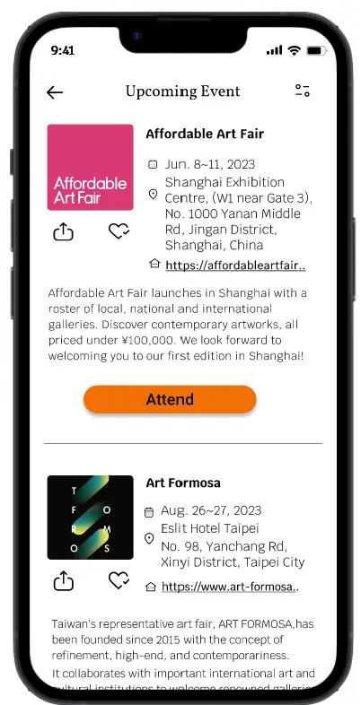
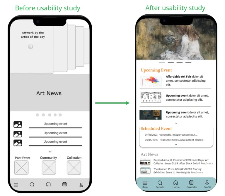
In the early design of the app homepage, users had difficulty locating the Scheduled Event section on the front page and were confused by the presence of too much irrelevant information. Additionally, the Upcoming Event was not centered, causing users to miss this key information at a glance.
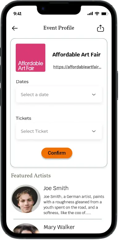
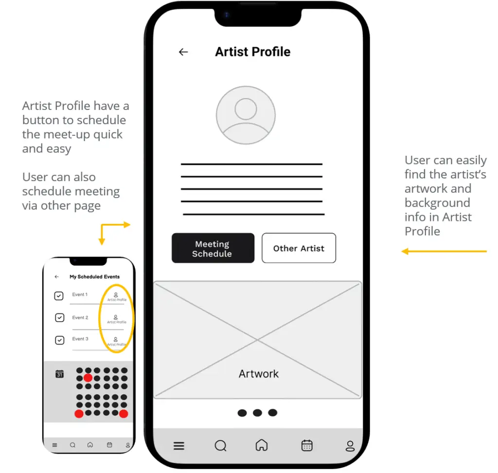
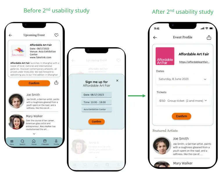
The second usability study uncovered user frustration with the event confirmation flow and the lack of options for selecting event details. In response, I integrated the sign-up page with the event profile, enabling users to choose time slots and tickets before confirming their interest in an event.
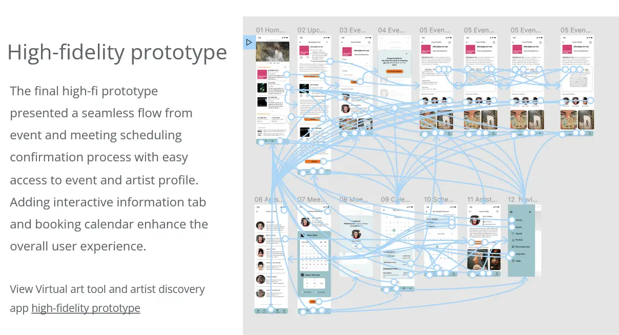
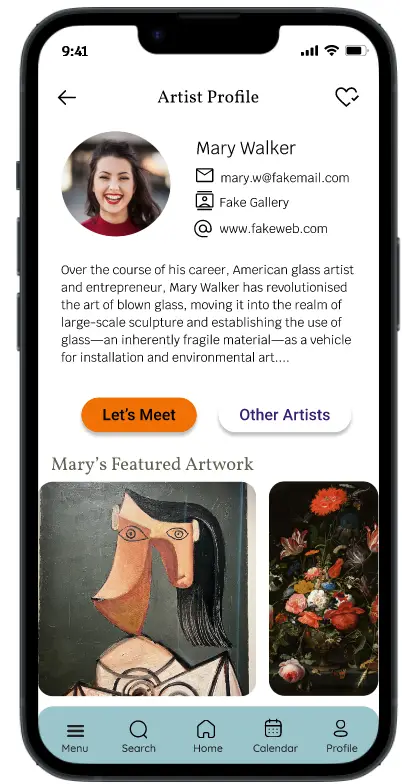
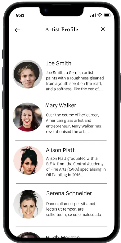
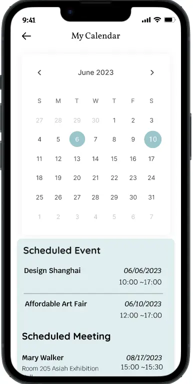
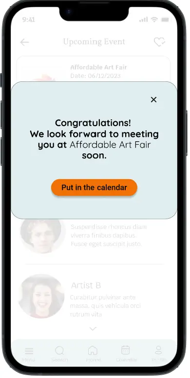
High-fidelity prototype
The final high-fidelity prototype delivers a smooth and intuitive flow for event and meeting scheduling confirmation, providing easy access to both event and artist profiles. Interactive information tabs and a booking calendar were added to enhance the overall user experience, making it more engaging and efficient. You can test the prototype here.
Going forward
Takeaways
Impact: This app offers art lovers a convenient way to manage their art-related activities and provides direct access to emerging artists right at their fingertips. One user shared their experience: “We visit art events occasionally. It’s great that this app reminds me of upcoming events and lets me schedule attendance. If I want, I can also arrange meetings with artists. This app makes it possible.”
What I learned: I learned that truly understanding what users are trying to communicate is essential, even when their words are implicit or unclear. Conducting research both before and throughout the project provides vital insights that drive continuous improvement of the app with each iteration.
Next Steps
Next steps include conducting another round of usability testing to ensure a seamless user flow, identify any remaining pain points, and uncover new user needs. Additionally, expanding the user group to include new artists and gallery owners through further interviews will help assess their fit with the app. For future iterations, integrating virtual tools such as AR and VR is planned to enhance the user experience.