Project Overview
Mr. Market is an investment learning platform in a mission to educate users who are interested to learn about basic investment knowledge for their personal financial planning. Equipped with simulation tools, it helps users learning by hands-on experience and transform into practical knowledge.
Timeline
12 weeks
My Role
UX designer and researcher, from conception to delivery
Responsibility
User research, user persona, user journey, competitive audit, paper and digital wire-framing, low & high-fidelity prototyping, usability studies, and iterating on responsive design
Summary
Product Vision
Mr. Market is an investment learning platform in a mission to educate users who are interested to learn about basic investment knowledge for their personal financial planning. Equipped with simulation tools, it helps users learning by hands-on experience and transform into practical knowledge.
The Problem
Most people is interested in learning about how to increase their “passive income” but is often impatient to “learn” the relevant knowledge. They also require hands-on experience before investing with the real money.
The Goal
Design an online platform, including app and website, for users to have diverse and motivated learning experience.
Understandign the Users
Summary
I conducted interviews and developed empathy maps to gain a deeper understanding of the users I’m designing for and to identify their needs. Focusing on two distinct target groups, I interviewed three teenagers and two adults. The younger users showed a preference for engaging, fun experiences they could share and use to impress their peers, while the adults prioritized seeing tangible results from their learning. Nearly all participants, however, had little to no experience accessing unbiased, reliable learning resources, often relying solely on advice from their close circles, who may lack legitimate investment knowledge.
Pain Points
Motivation
Users often lack a sense of urgency or compelling incentives to stay engaged with ongoing learning activities.
Interaction experience
Most content is text-heavy, with limited variety in presentation methods. This makes it harder for users to engage with and retain information that may already seem uninteresting.
Fear of Complexity
Many users perceive investing as complicated and challenging to understand, believing it demands significant time and effort to develop expertise.
Persona
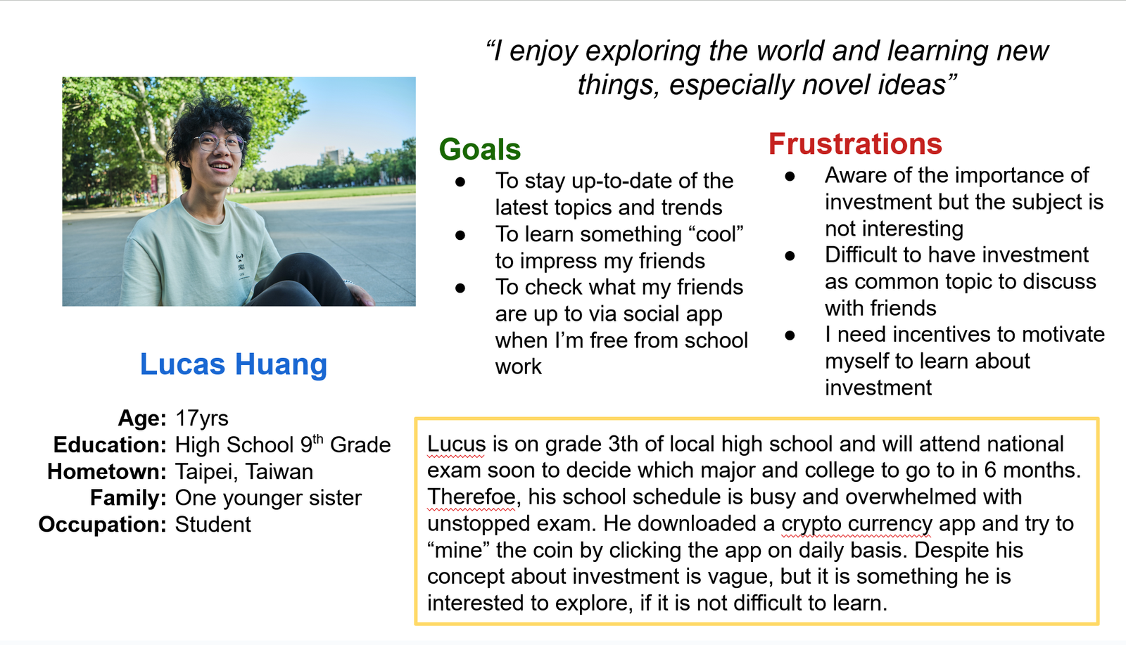
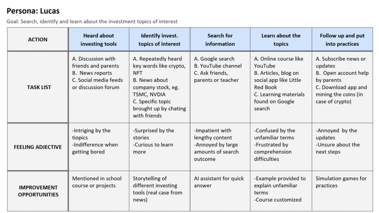
Problem statement Lucas is a ninth-grade student who wants to learn how to manage his savings so he can afford to buy the things he desires.

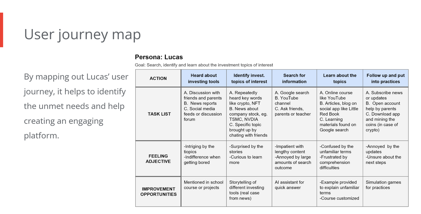
User Journey Maps
Mapping out Lucas’ user journey helps identify his unmet needs and guides the creation of an engaging platform tailored to him.
Starting the design
Crazy Eight
Sitemap
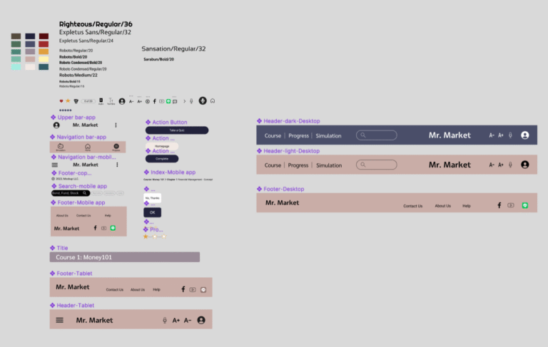
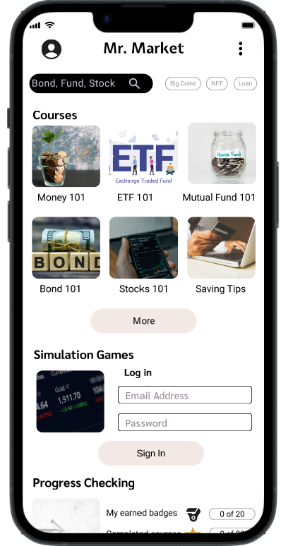
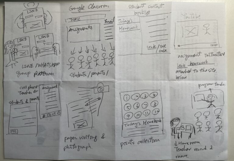
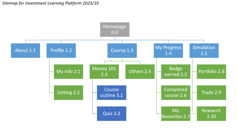
The information architecture of the Investment Learning platform is straightforward. I outlined the core features the platform must include, such as courses, progress tracking, and simulations. To enrich each element, I incorporated detailed references and best practices drawn from competitor sites and apps identified during the competitive audit. This approach ensures the platform is both user-friendly and comprehensive, aligning with industry standards for effective online learning environments.
Paper wireframes
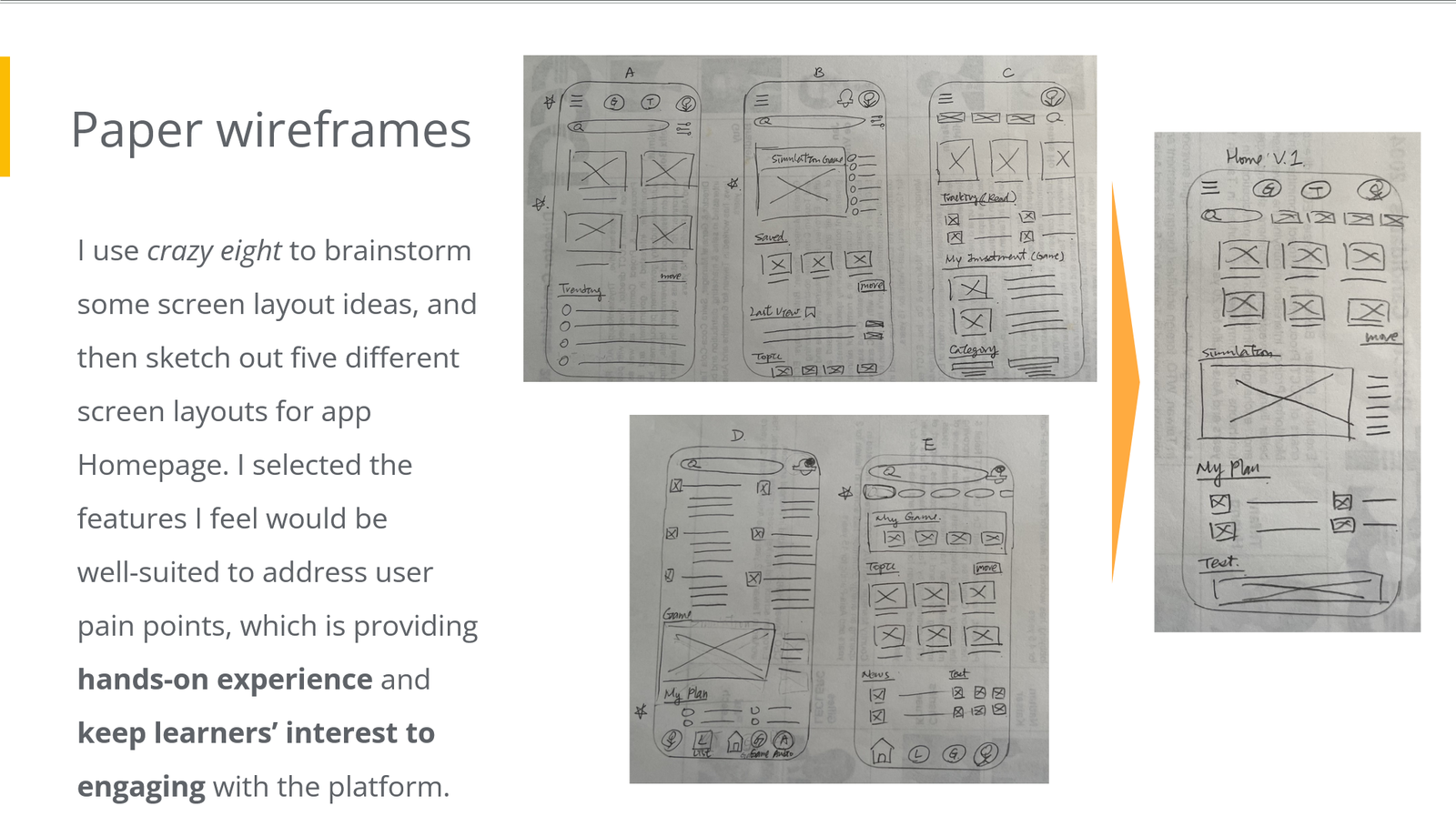
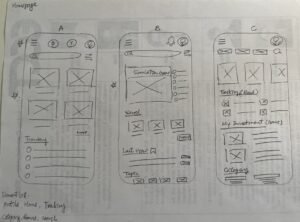
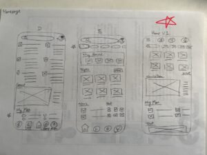
I used the Crazy Eights technique to quickly generate screen layout ideas, then sketched five different homepage designs for the app. I chose features that I believe effectively address user pain points by offering hands-on experience and maintaining learners’ engagement with the platform.
Digital wireframes
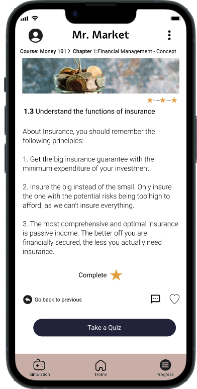
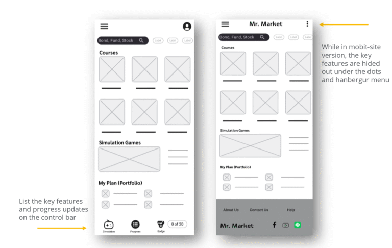
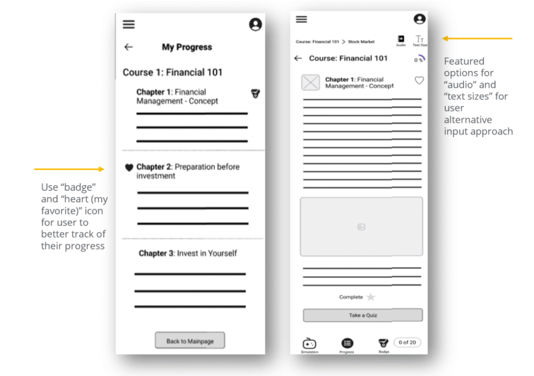
Building on the initial paper wireframe sketches, I developed detailed digital wireframes and created a mobile-site version of the platform for the initial design phase. The core idea is to enhance the user’s learning experience by incorporating features such as badges, heart icons, and options for alternative content delivery, including adjustable text size and audio playback.
Low-fidelity prototype
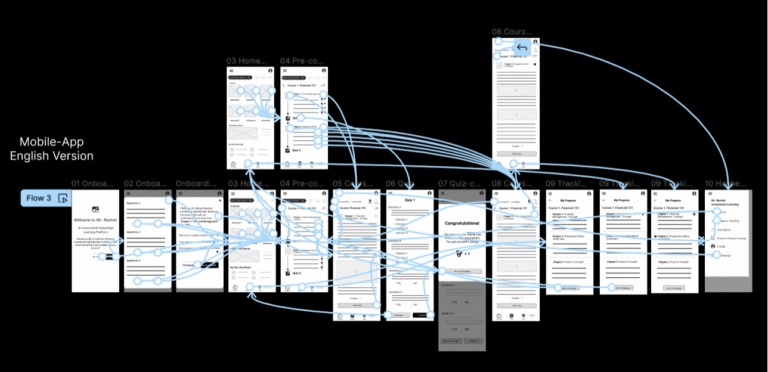
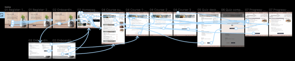
I created a low-fidelity prototype by linking all the screens involved in the main user flow—from taking the onboarding quiz to completing a course section and tracking progress. This prototype allows for early testing of core functionality and user experience. You can test the prototype here
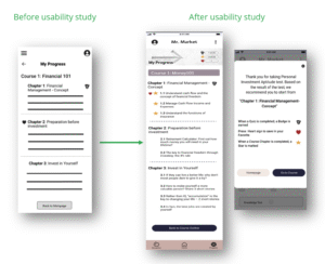
Usibility study findings
I conducted two rounds of usability studies. Findings from the first study helped guide the designs from wireframes to mock-ups. The second study used a high-fidelity prototype and revealed what aspects of the mock-ups needed refining.
Inconsistent Progress Button Labels
Users are confused because the progress button has different titles in the control bar and the menu, leading to uncertainty about its function.
Accessibility
The progress tracking button is not always clickable, and course content cannot consistently be accessed through different entry points, causing frustration.
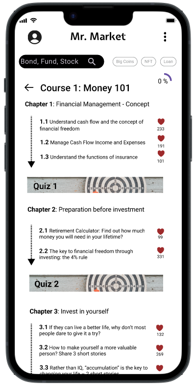
Progress Cues
When navigating course content, users struggle to determine which sections they have completed and are unsure about the next steps to take in their learning journey. These issues highlight the need for a clear, consistent, and intuitive progress tracking system that provides real-time updates and granular completion indicators, such as progress bars or checkmarks, to guide learners effectively
Redefining the design
Mockups
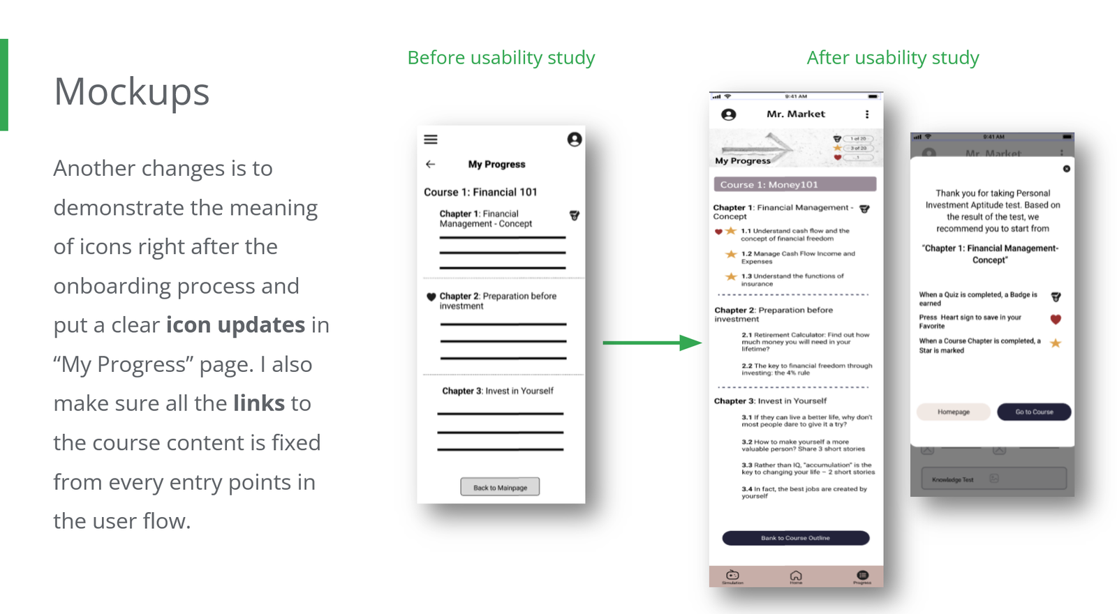
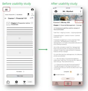
Based on insights from the usability study, I made several improvements to enhance the user flow. One key change was clarifying the progress indication icon to clearly show users their current stage in the learning process. I also removed the hamburger menu, leaving only a Progress button in the control bar to resolve the issue of inconsistent progress button titles. Additionally, I replaced the hamburger menu with a Homepage button in the control bar to improve navigation, addressing user feedback requesting all options be visible on screen for immediate access.
To further support users, I introduced explanations of icon meanings immediately after the onboarding process and added clear icon updates on the “My Progress” page. Finally, I ensured that all links to course content are fixed and accessible from every entry point in the user flow, providing a seamless and consistent learning experience.
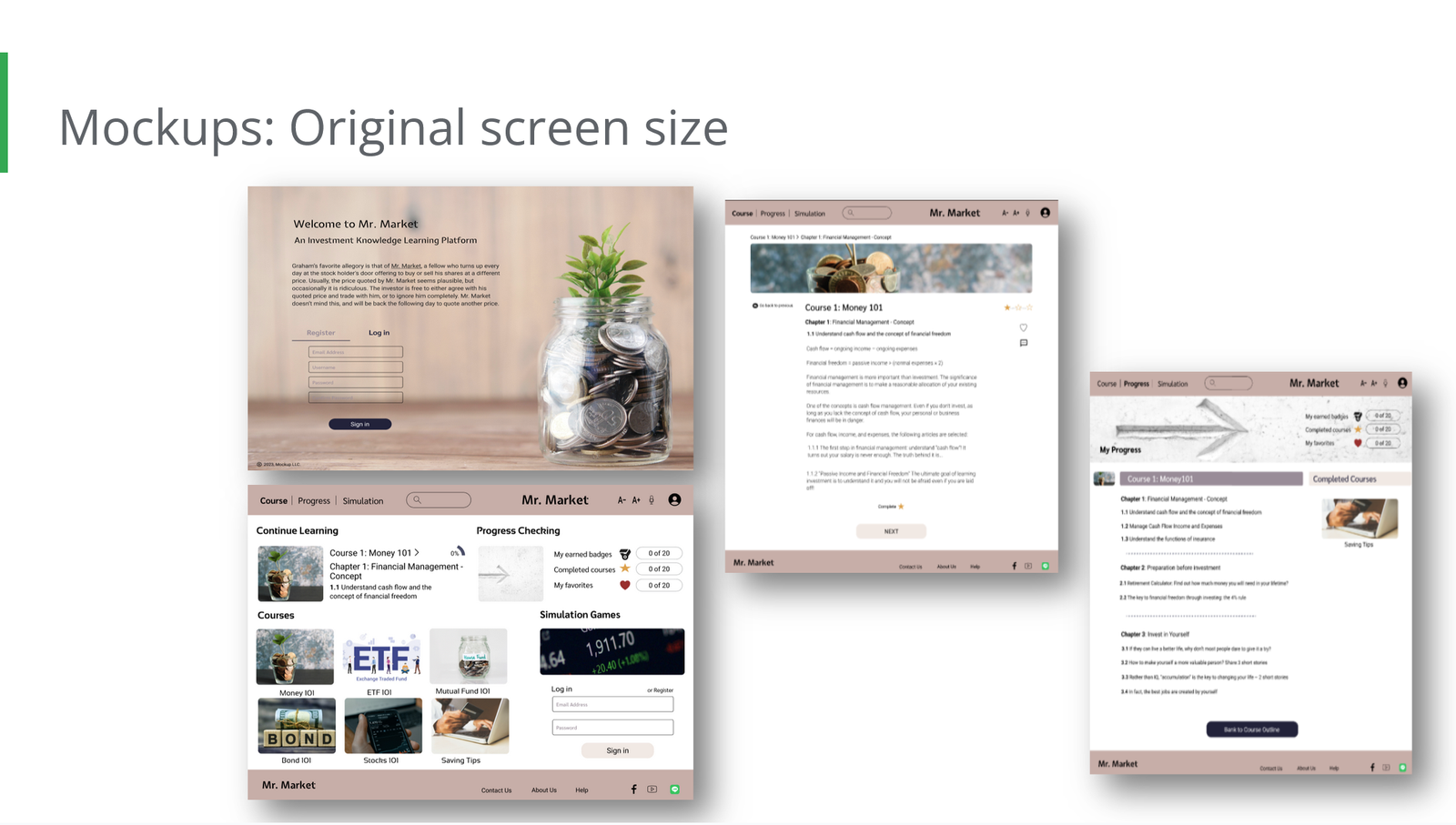
Screen size variations (for Responsive Web Design, RWD)
I incorporated considerations for various screen sizes into my mock-ups, building on the earlier wireframes. Since users access the platform from a wide range of devices, including mobiles and tablets, it was essential to optimize the browsing experience for different screen dimensions. This approach ensures a smooth, consistent, and user-friendly experience across devices, accommodating touch interactions, readable text, and intuitive navigation to enhance overall usability.
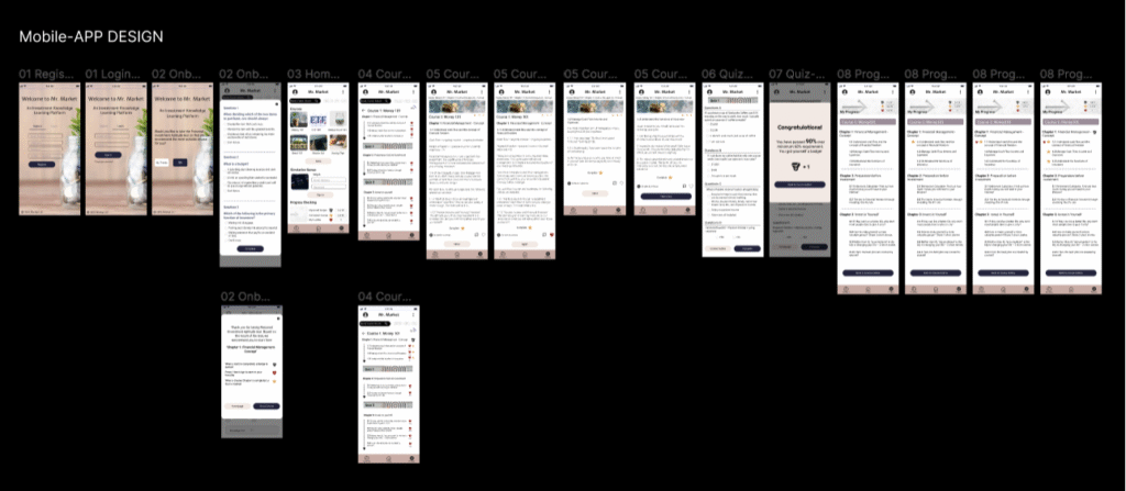
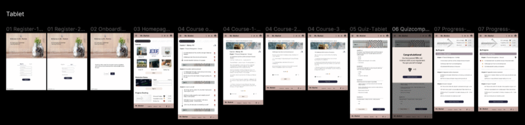
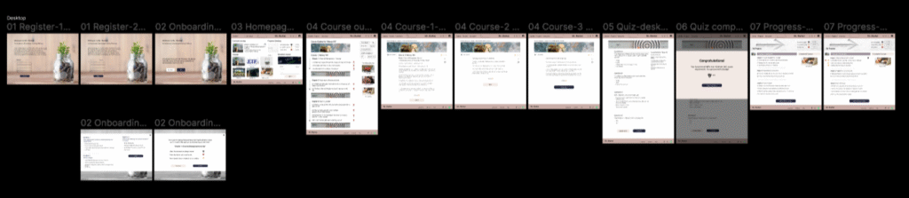
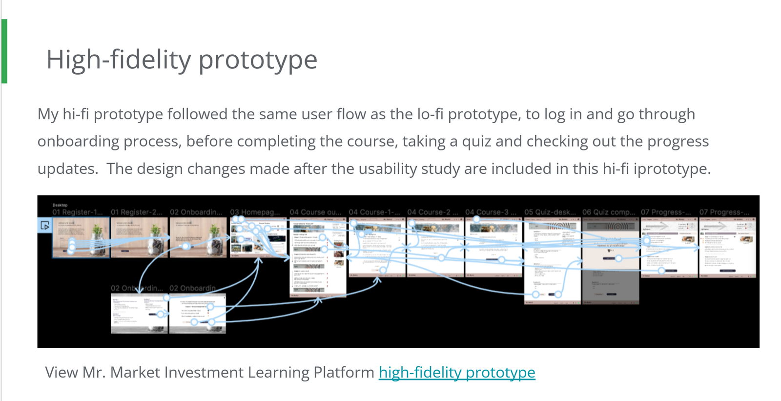
High-fidelity prototype
My high-fidelity prototype follows the same user flow as the low-fidelity version: logging in, completing the onboarding process, finishing the course, taking a quiz, and reviewing progress updates. It incorporates the design improvements identified during the usability study. You can test the prototype here
Going forward
Takeaways
Impact: Our target users reported that the design was intuitive to navigate, more engaging due to the use of images, and featured a clear visual hierarchy that effectively guided their attention.
What I learned: From this experience, I learned that even small design changes can significantly enhance the user experience. The key takeaway for me is to consistently prioritize the real needs of users when developing design ideas and solutions, ensuring clarity, ease of use, and meaningful engagement through well-structured visual hierarchy and thoughtful design elements
Next steps
- Complete the remaining user flow elements, such as simulation games.
- Conduct follow-up usability testing on the updated website.
- Identify further user needs and brainstorm new feature ideas.